
Friday, August 8, 2008
Bilateral Graph

This bilateral graph shows a poll of chinese government satisfaction among the population.
Bivariate Chloropleth Map

Given a set of geographic features, it maps two variables on a single map by combining two different sets of graphic symbols. the term "bivariate maps" specifically refers to bivariate choropleth maps that display two variables using graduated color symbols. Here we see a bivariate map showing population stats from France. http://images.google.com/imgres?imgurl=http://go.owu.edu/~jbkrygie/krygier_html/geog_353/geog_353_lo/geog_353_lo08_gr/choro_1836.jpg&imgrefurl=http://mavance2000.blogspot.com/2008/07/bivariate-choropleth-map.html&h=472&w=360&sz=79&hl=en&start=11&tbnid=6TEgPKlY89GShM:&tbnh=129&tbnw=98&prev=/images%3Fq%3DUnclassed%2Bchoropleth%2Bmaps%26gbv%3D2%26ndsp%3D21%26hl%3Den%26sa%3DN
Saturday, August 2, 2008
Digital Line Graphs

Digital Line Graphs (DLGs) are digital vector representations of cartographic information derived from USGS maps. The advantage to using DLGs in a GIS setting is that the vector features can be rendered at any scale, such that zooming in and out on the map does not change the quality of the topographic data representation.
Box plots

A boxplot, or box and whisker diagram, provides a simple graphical summary of a set of data. A box plot provides an excellent visual summary of many important aspects of a distribution.
This shows crop yields.
Histogram
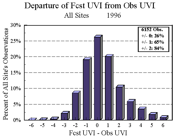
A histogram is used to graphically summarize and display the distribution of a process data set. This is a histogram from the National Weather Service depicting the UN index frm 1996.
Parallel Coordinate System
 This graph shows baseball statistics. In the parallel coordinates plot, each dimension (variable) corresponds to an axis, and the N axes are organized as uniformly spaced vertical lines. A data element in N-dimensional space manifests itself as a connected set of points, one on each axis. Points lying on a common line or plane create readily perceived structures in the image.To view an entire dimensional data set, one simply plots all observations on the same graph. For large data sets, the appearance of such a plot appears confusing, but can be used to highlight outliers.
Subscribe to:
Posts (Atom)