
Friday, August 8, 2008
Bilateral Graph
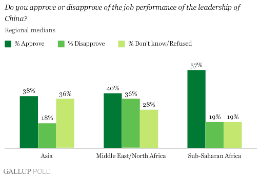
This bilateral graph shows a poll of chinese government satisfaction among the population.
Bivariate Chloropleth Map

Given a set of geographic features, it maps two variables on a single map by combining two different sets of graphic symbols. the term "bivariate maps" specifically refers to bivariate choropleth maps that display two variables using graduated color symbols. Here we see a bivariate map showing population stats from France. http://images.google.com/imgres?imgurl=http://go.owu.edu/~jbkrygie/krygier_html/geog_353/geog_353_lo/geog_353_lo08_gr/choro_1836.jpg&imgrefurl=http://mavance2000.blogspot.com/2008/07/bivariate-choropleth-map.html&h=472&w=360&sz=79&hl=en&start=11&tbnid=6TEgPKlY89GShM:&tbnh=129&tbnw=98&prev=/images%3Fq%3DUnclassed%2Bchoropleth%2Bmaps%26gbv%3D2%26ndsp%3D21%26hl%3Den%26sa%3DN
Saturday, August 2, 2008
Digital Line Graphs

Digital Line Graphs (DLGs) are digital vector representations of cartographic information derived from USGS maps. The advantage to using DLGs in a GIS setting is that the vector features can be rendered at any scale, such that zooming in and out on the map does not change the quality of the topographic data representation.
Box plots

A boxplot, or box and whisker diagram, provides a simple graphical summary of a set of data. A box plot provides an excellent visual summary of many important aspects of a distribution.
This shows crop yields.
Histogram
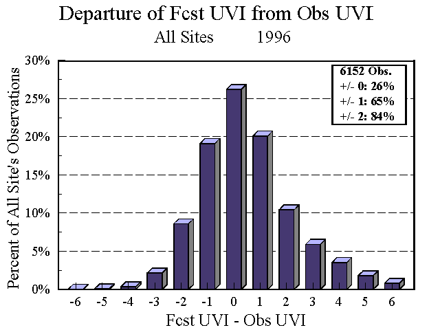
A histogram is used to graphically summarize and display the distribution of a process data set. This is a histogram from the National Weather Service depicting the UN index frm 1996.
Parallel Coordinate System
 This graph shows baseball statistics. In the parallel coordinates plot, each dimension (variable) corresponds to an axis, and the N axes are organized as uniformly spaced vertical lines. A data element in N-dimensional space manifests itself as a connected set of points, one on each axis. Points lying on a common line or plane create readily perceived structures in the image.To view an entire dimensional data set, one simply plots all observations on the same graph. For large data sets, the appearance of such a plot appears confusing, but can be used to highlight outliers.
Traingle Plot

A triangle plot is a graph of 3 variables. It is most often used in geologic studies to show the relative compositions of soils and rocks, but it can be more generally applied to any system of three variables. Tot he left a Triangle plot depicts the voting pattern in the 2005 election in Britain. It shows the three major political parties.
Windrose

Presented in a circular format, the wind rose shows the frequency of winds blowing from particular directions. The length of each "spoke" around the circle is related to the frequency that the wind blows from a particular direction per unit time. Each concentric circle represents a different frequency, emanating from zero at the center to increasing frequencies at the outer circles. The image to the left shows 5 locations in Washington State.
Climograph

a climograph is a graph that shows the climate of a place. Specifically, a climograph shows the monthly temperature and precipitation of a certain place in the world at a given period of time. Most climographs show this information over an annual span.
For this map you can click on a red dot to view the average monthly temerature and percipitation.
Population Profile
 A population profile map is failry self explanitory. Here is population breakdown if the Islamic religion based on country.
 Scatter Plots

Scatter plots are similar to line graphs in that they use horizontal and vertical axes to plot data points. However, they have a very specific purpose. Scatter plots show how much one variable is affected by another. The relationship between two variables is called their correlation .
Scatter plots usually consist of a large body of data. The closer the data points come when plotted to making a straight line, the higher the correlation between the two variables, or the stronger the relationship.
Scatter plots usually consist of a large body of data. The closer the data points come when plotted to making a straight line, the higher the correlation between the two variables, or the stronger the relationship.

Lorenz Curve

The Lorenz curve is used in economics and ecology to describe inequality in wealth or size. If all individuals are the same size, the Lorenz curve is a straight diagonal line, called the line of equality. If there is any inequality in size, then the Lorenz curve falls below the line of equality.
Continuously variable proportional circle map
A continuous proportional circle map is one that uss circles to show point data. Depicted here is a landscape analysis based on terrain.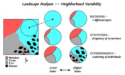
DOQQ
 A digital orthophoto quadrangle (DOQ) is a computer-generated image of an aerial photograph in which image displacement caused by terrain relief and camera tilts has been removed. It combines the image characteristics of a photograph with the geometric qualities of a map. Shown here is a post Hurricaine Katrina map of Louisiana.
DEM

DEM (Digital Elevation Model)A digital map of the elevation of an area on the earth. The data are either collected by a private party or purchased from an organization such as the U.S. Geological Survey (USGS) that has already undertaken the exploration of the area. Digital elevation models are gray scale images wherein the pixel values are actually elevation numbers.
Stem and leaft plot

A stem and leaf plot is a quick way to find the shape of distribution and it includes actual numerical values in a graph. A stem-and-leaf plot is essentially a dotplot in which the plotting symbol is replaced by the data value itself. It provides an informal alternative to a histogram when carrying out exploratory data analysis. To the left is an example.
Similarity Matrix

A similarity matrix is a matrix of scores which express the similarity between two data points.
Shown here is the similarity between two Bacterial genetic systems.

Star Plots

The star plot is a method of displaying multivariate data. Each star represents a single observation. Typically, star plots are generated in a multi-plot format with many stars on each page and each star representing one observation. in the map on the left, crime rates for different cities in the US is depicted.

Friday, August 1, 2008
ISOHYETS-Rainfall

An ISOHYET map uses lines drawn on a map connecting points that receive equal amounts of rainfall. Shown here is a map of Africa and the amounts of rainfall. Notice the lack of lines in the Sahara desert region.
ISOTACHS
 An ISOTACH map uses a line along which the speed of the wind is constant. Isotachs are represented on surfaces of constant elevation or atmospheric pressure, or in vertical cross sections. The closeness of spacing of the isotachs is indicative of the intensity of the wind on such surfaces. Shown here is the wind velocity in the US.
ISOBARS-Wheather

An ISOBAR map uses an imaginary line or a line connecting or marking places of equal barometric pressure. Meaning it is used to show weather patterns. Shown here is an ISOBAR map of Europe.
LIDAR-Manhattan
 A LIDAR map is a meteorological instrument using transmitted and reflected laser light for detecting atmospheric particles, as pollutants, and determining their elevation. For this map I chose to use a LIDAR map of New York City showing the elevation of the tall buildings.
Doplar Radar-Tallahassee

A radar system used to measure the relative velocity of the system and the radar target. The operation of these systems is based on the fact that the Dopplar frequency shift in the target echo is proportional to the radial component of target velocity. Most often used to show moving weatherpattern. Shown here is a map showing Tallahassee and the rain about to be dropped on our heads.

Infrared Aerial Photos

Infrared film and infrared digital sensors are sensitive to a certain portion of the spectrum of light, and by careful filtration, processing and selection of films, infrared aerials can provide invaluable information. Usually infrared is sensitive to heet. Shown here is a map of Florida which shows a darkened area of hot fires and a lightened area of chilled cloud tops.
Cartographic animation-Wind Velocities
 A cartographic animation is the application of animation, either computer or video, to add a temporal component to a map displaying change in some dimension. Most commonly the change is shown over time, generally at a greatly changed scale. Shown here is the average wind velocities.
Statistical Map-The Brain
 A statistical map is a special type of map in which the variation in quantity of a factor such as rainfall, population, or crops in a geographic area is indicated; a dot map is one type. Many of the maps in this blog are in actuality a statistical map. This map shows the brain and the colored areas depict some sort of known brain activity.
Cartograms-Size of country based on population
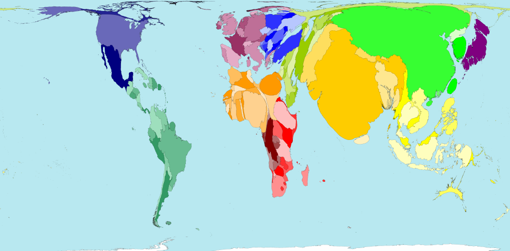 A cartogram is a map in which some thematic mapping variable is depicted. The map on the left shows the size of each country relative to its population size. Notice how scale and shape are distorted. For example, India is shown to almost be the same size as the continent of Africa.
Flow Maps-New Orleans Trucking Flow
 Flow maps are made to show the movement of objects from one location to another, such as the number of people in a migration, the amount of goods being traded The advantage of flow maps is that they reduce visual clutter by merging edges. Shown here is a network of Truckiong flow out of the Port of New Olreans in Louisiana.
Isoline Maps-Hawaii Rainfall
 An isoline map is a map with continuous lines joining points of the same value. Isoline mapping is used to interpret the information on some thematic maps. Depicted here is the rainfall on one of the islands of Hawaii.
Proportional Circle Maps

A proportional circle map is a type of statistical map. The map on the left shows areas of urban population in the Great lakes area.
Chloropleth Map
 A chloropleth map uses graded differences in shading or color or the placing of symbols inside defined areas on the map in order to indicate the average values of some property or quantity in those areas. TThis map uses shaded area to show the concentration of urban living in the US.
DOT Distribution Map

Dot distrubution maps are used to depict areas of high human population. This is shown in the map on the left. judging by the map the majority of the population is concentrated in China, India, Europe and eastern North America.
Propaganda Map-German advances WWII
 Propaganda maps are designed to have a maximum psychological impact on the user of the map. They are also used to achieve a political goal. The map to the left was used by the allies during WWII.
Hypsometric Map
Agean Sea
In topographic surveying, a map giving elevations by contours, or sometimes by means of shading, tinting, or batching. Shown to left if a map of the Agean sea off the coast of Greece.
In topographic surveying, a map giving elevations by contours, or sometimes by means of shading, tinting, or batching. Shown to left if a map of the Agean sea off the coast of Greece.
PLSS Map
 The PLSS actually consists of a series of separate surveys. Most PLSS surveys begin at an initial point, and townships are surveyed north, south, east, and west from that point. The north-south line that runs through the initial point is a true meridian and is called the Principal Meridian. Shown here is a map of the US. States not in color were surveyed prior to the Revolutionary War, with the exception of Texas.
Cadastral Map
 A legal map for recording ownership of property. The map describes boundaries and ownership. The map to the left is of the different provinces of The Netherlands (a place i called home for over a year).
 Thematic Map
 Thematic maps are used to display geographical concepts such as density, distribution, relative magnitudes, gradients, spatial relationships and movements. This is a map of my home state of California. This map is much like any map you would see in a classsroom.
Topo map
 A map depicting terrain relief showing ground elevation, usually through either contour lines or spot elevations. The map represents the horizontal and vertical positions of the features represented. Again I chose to show a map of Iraq, this time using a topo map. Notice this time there is physical features dipicted.
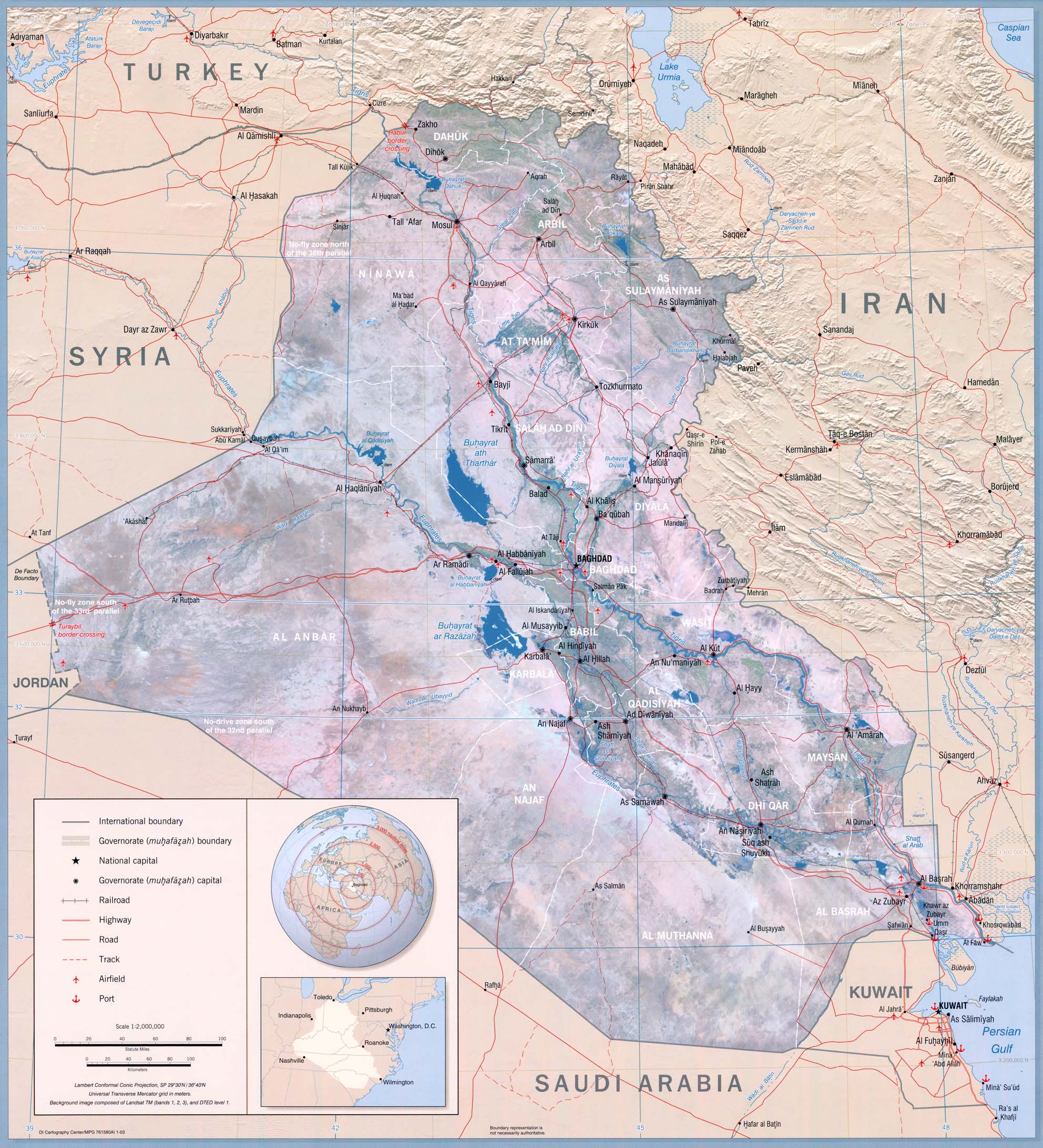
Planemetric Maps

A planimetric map is a map that represents only horizontal positions of features and not the vertical positions as in a topo map. Notice the map of a Iraq, there is no elevation features just roadways.
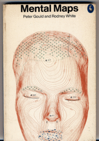
Mental Maps

Mental maps are absracted views of real locations. Here we see a person drawing a map from memory of a few streets in London.
Friday, June 27, 2008
Week 7 Post-Map of Active Fires in the US as of June 24th

This is supposed to be a Remote sensing map of active fires in the US as of 24 June 2008. I pulled the image from the US Forestry Department's website that used the KML file to show active fires. In Google Earth the image was much bigger and showed the concentration of fires in Northern California. Im not sure why the image is so small on this or why it doesn't show the active fires as it does when the image is shown in Google Earth.
Subscribe to:
Comments (Atom)